Park View
Park View
A commercial mall identity with a refined retail presence and polished print system.
Park View is a commercial mall identity created to present the destination as a modern retail environment with a clear name, memorable mark and polished customer-facing materials.
The system balances accessibility with a premium tone, giving the mall a flexible identity that works across leasing presentations, brochures, wayfinding moments and printed applications.
- Project
- Commercial Mall Identity
- Scope
- Brand Identity & Print System
- Audience
- Visitors, Tenants & Investors
- Deliverables
- Logo, Collateral & Brochure Design
Design Highlights
- — A bilingual logo system built for recognition in commercial and retail settings.
- — A premium color direction that supports both visitor communication and investor presentations.
- — Printed applications that make the brand feel established, physical and ready for launch.
- — A brochure structure that organizes mall services and destination benefits clearly.
- — A flexible identity that can extend into signage, leasing documents and social content.
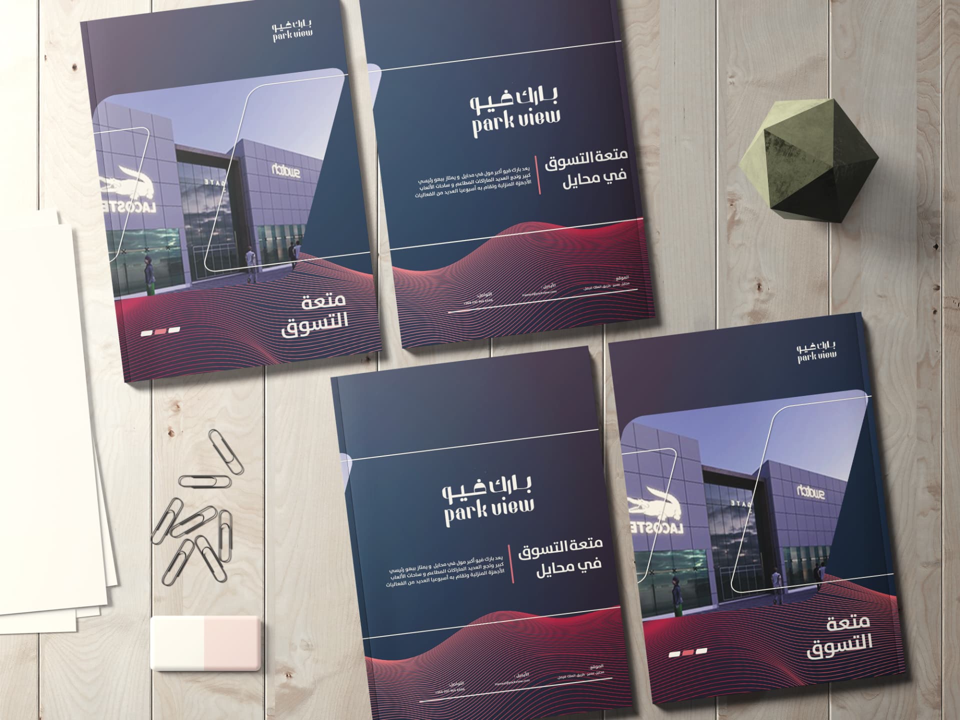
A premium mall identity presented through tactile print applications and a confident visual rhythm.
A bilingual wordmark designed to feel clear, approachable and suitable for retail destinations.
A refined mark treatment that supports a more premium leasing and presentation context.
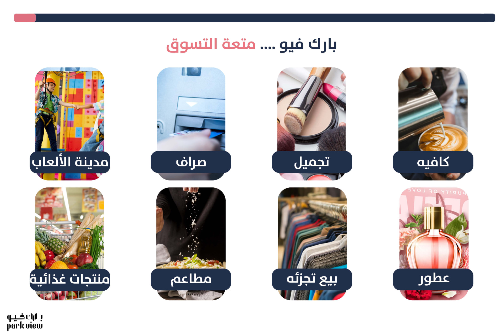
A structured information layout for presenting services, amenities and the mall experience.